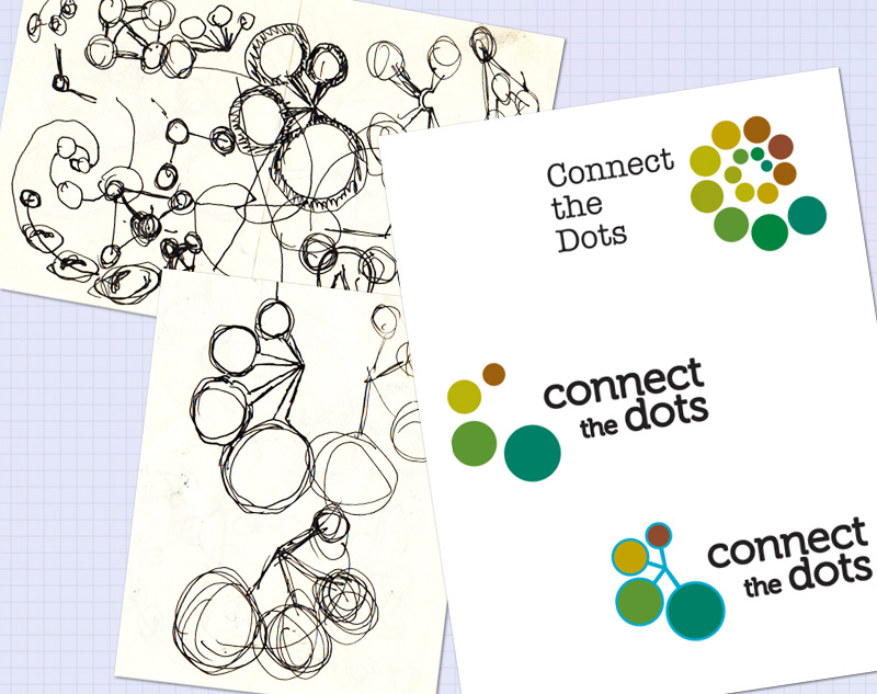
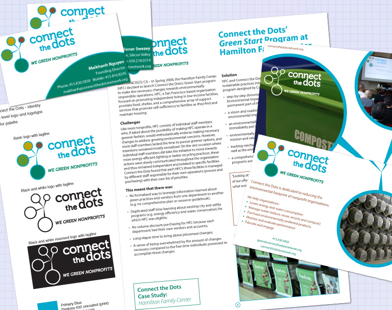
Connect the Dots, a non-profit in San Francisco, needed an identity that visually represents how they “connect the dots” for other non-profits looking to maximize their resources by cutting wasteful spending on overhead through the adaption of green practices.
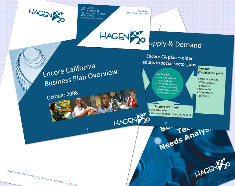
Hagen 20/20 is a Customer Relationship Management (CRM) consultancy. They wanted an identity that revolved around the concept that Hagen 20/20 has the vision and focus to help its customers improve their CRM, thereby increasing loyalty and repeat business.
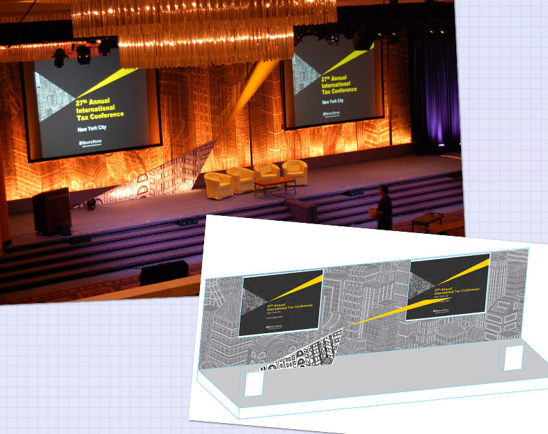
With the introduction of a new identity,
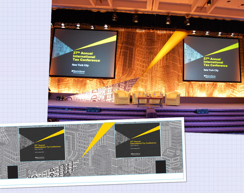
Ernst & Young needed a new stage design for
their largest client facing conference.
Leveraging the major elements of the identity
(the input and out graphical “rays”) the stage
was transformed into a highly successful physical manifestation of the new identity.